DevLog #4: Typography of TOSOD
Today, I want to talk about TOSOD's typography. It seems that you rarely encounter a video game made by people who have studied typography. I want TOSOD to be different in that regard. I want to impress my players with my attention to detail in matters concerning fonts.
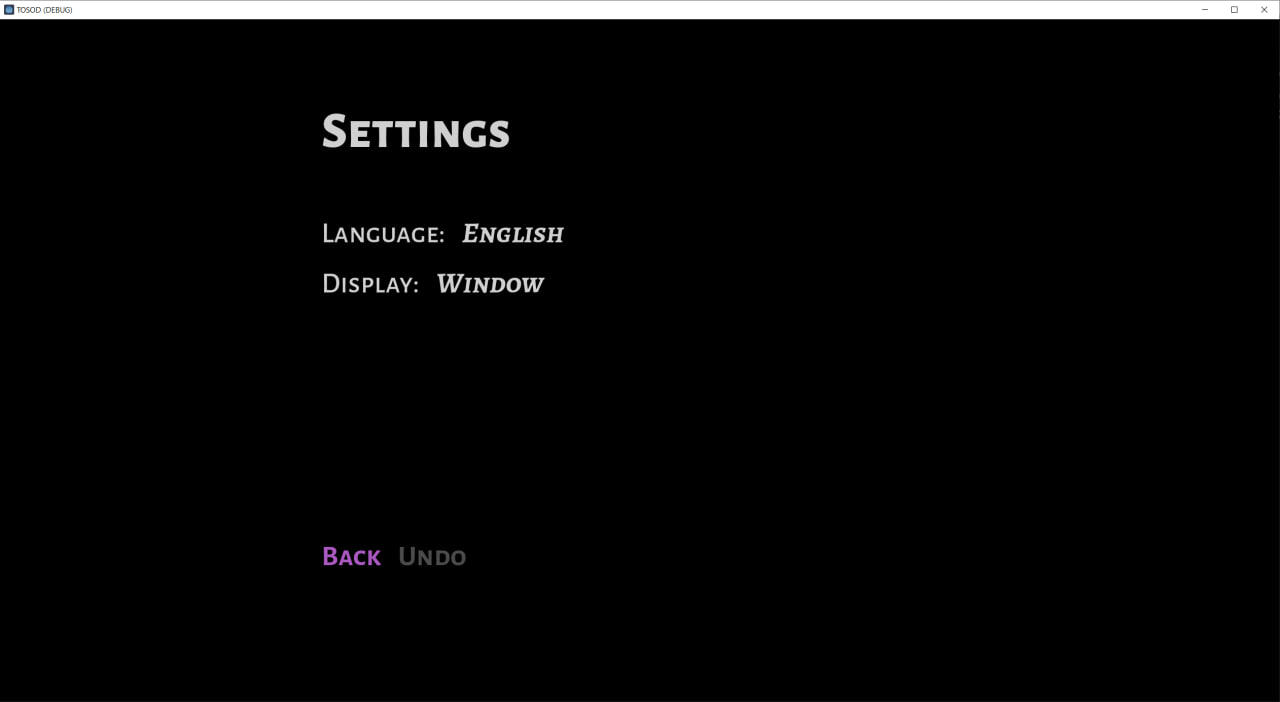
Below is a screenshot from the settings menu, and it alone has four different variations of fonts and their options, such as italic or not, bold or not, sans or serif, caption or not, while all of that is generally small caps. I am a huge believer in small caps, I love them dearly, and I will use them every time I can. Unfortunately, the heading font size is a bit off, but you get the idea.

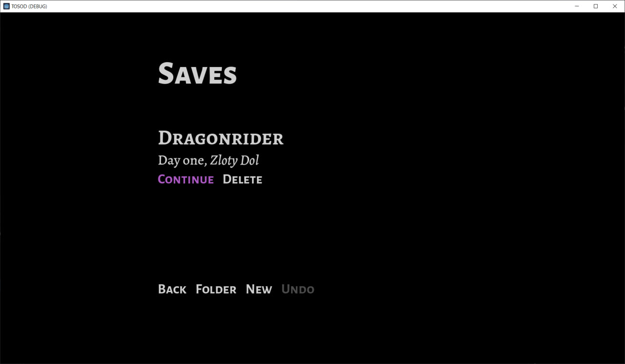
This here below is another example of typography in TOSOD (save loading menu), this time with even more diversity in fonts.

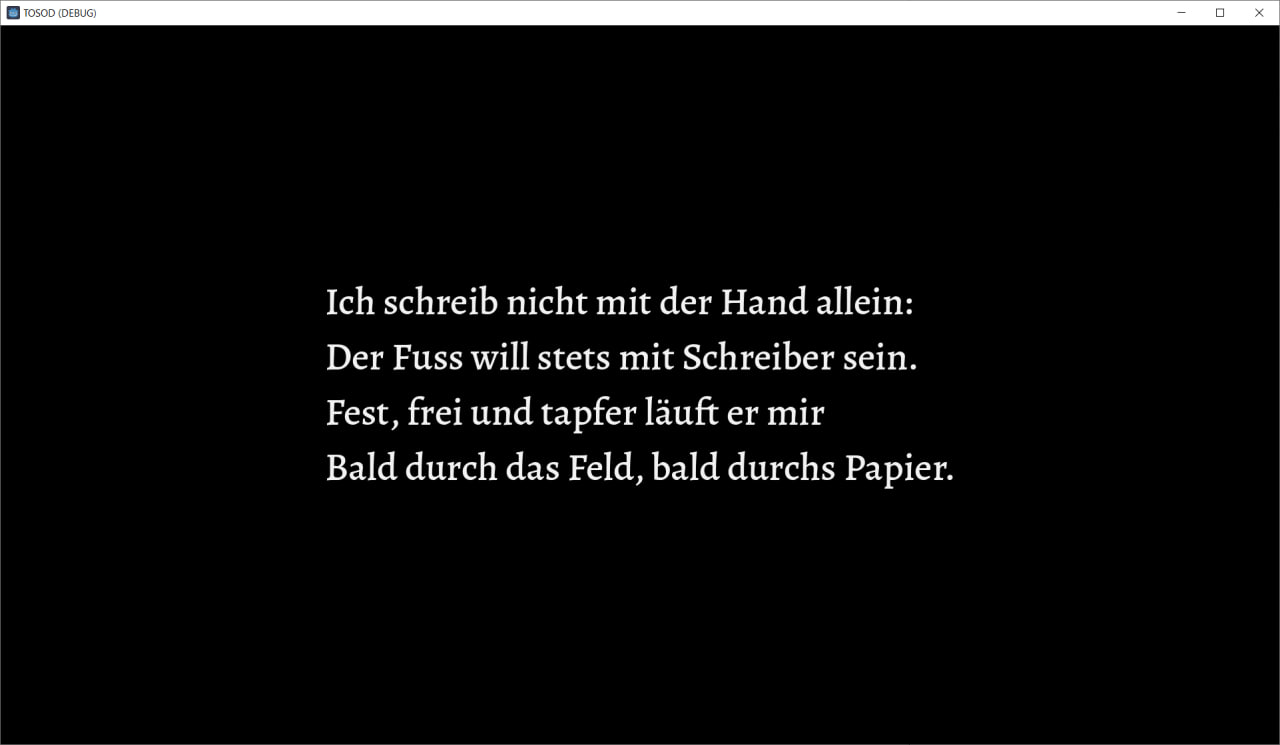
And this is what a slideshow screen looks like:

Thank you for your interest in this project. Stay tuned, join the game’s Discord server, and follow me on Twitter.
Files
Get The Other Side of Despair
The Other Side of Despair
A moddable top-down pixel RPG inspired by “The Witcher 3” and “Elden Ring”
| Status | In development |
| Author | 42juododranoel |
| Genre | Adventure, Role Playing |
| Tags | 2D, Anime, Characters, Exploration, Fantasy, Meaningful Choices, Pixel Art, Story Rich, Top-Down |
More posts
- DevLog #3: Mod Loader and Modding PhilosophyAug 07, 2024
- DevLog #2: The Title Menu and the First BuildJul 27, 2024
- DevLog #1: Starting of TOSOD and Why I Believe in 32x32Jul 07, 2024

Leave a comment
Log in with itch.io to leave a comment.